MÜLLER BROCKMANN.
InDesign is an Adobe program whereas you can create pages as a form of graphic design, we had recently searched up Müller Brockmann as he is a good example of this; his pages are simple and easy to navigate, and we were tasked with replicating a page with beginner knowledge, and I decided to do the first page we saw; though there’s a lot different about it.

Being inexperienced with InDesign, I tried to take inspiration- though it looks a bit dull. The designer always had it simple and sharp, much like this, though there were a few added touches- I simply coloured the background red and added text in black and white, I would have added lines and small shapes to make it pop.
BREAKING DOWN INDESIGN.

Bleed and Slug is an option that pops up when setting up your spread, it’s quite a nice tool to use because it lets you see how much space you can use outside of the initial sheet; I usually use 5 mm on both- you’re able to keep them all the same number with the link button next to it, and once you’ve set your amount it’ll look something like this;

The red line is bleed, the blue line is slug, again, it’s very useful.

Once you have a spread set up, you can add two pages in one with the pages tab; you can simply switch up the spreads with a-master once you’ve created a new spread, which will look like this;

Two spreads in one!

Columns also appear when you set up your spread at first, alongside Bleed and Slug- but it was much better to show it from here, with columns, you’re able to create columns that you can attach image boxes too, as seen below;

Using the image box tool, I can draw a box with an X inside it- with this I can put any colour, image or gradient inside it without it affecting the rest of the page, you can adjust images that don’t fit the box by either adjusting the image size or the box size.

Using the gradient tool, I show that it doesn’t affect the rest of the page.

There’s a text tool as well, which is much like the image box tool; but unlike the other programs, you can fill the box with Lorem Ipsum- placeholder text, depending on the layer you have the text on it can either go over or under the images.
There’s also a text wrap option that allows your text to essentially wrap around the image if there are transparent parts in it- for example; a castle with spires, the text can go between those spires.
CONTEXTUAL PERSPECTIVES.
Contextual perspectives consider the relationship between two separate things and their differences. They examine five key components; historical, political, social, cultural and geographical. In this case we’ll be looking at a pair of designs and how they read.

Here is a spread from George Brown College; a newsletter for the students there. It’s simple, easy to read and the small points of colour (black, white and the red) pop out and can be seeable. It’s very easy to navigate for something that comes from a college- but then again, this college is a college for design, I’d say this obviously has American roots to it, as the name drop for North America is obvious. I’m unsure of there’s any political or historical meaning to it- after all, it is a college newsletter about their requirements and the like.

There’s a lot going on in this cover, the colours make it work however! They majorly contrast and pop out against other colours they’re placed with, there’s a large amount of yellow as the obvious clear colour, but I can see there’s black, white, cream, red and grey in the mix as well. It’s a very basic design with a lot to notice on it; I’d say the cultural and geographical roots are from Germany, as there’s the mention of gestalten and the colour scheme.
When putting them together, one can tell there’s a big difference- one is simple, the other is a bit out there, coming from opposite sides of the world and opposing colour schemes, the social standard for these two are to sell themselves and to be an example. Their roots are obvious and they are both very easy to read; which is the goal for most magazine spreads.
GRAPHIC DESIGNERS.
List of graphic designers.
- Muller Brockmann
- Paul Rand
- David Carson
- Milton Glascor
- Paula Scher
- Neville Brody
- Alan Fletcher
- Saul Bass
PAUL RAND.

Paul Rand’s designs are inherently very simplistic and neat, easy to read, though albeit difficult to understand. The design above is one of his best works; IBM. The use of the phonetic pictures is very nice, and it clicks once you say it out loud- each icon is please to the eye and much different from the others, in which they do not meld. It’s a rather basic design and Paul Rand does basic designs very very well.
MILTON GLASCER.
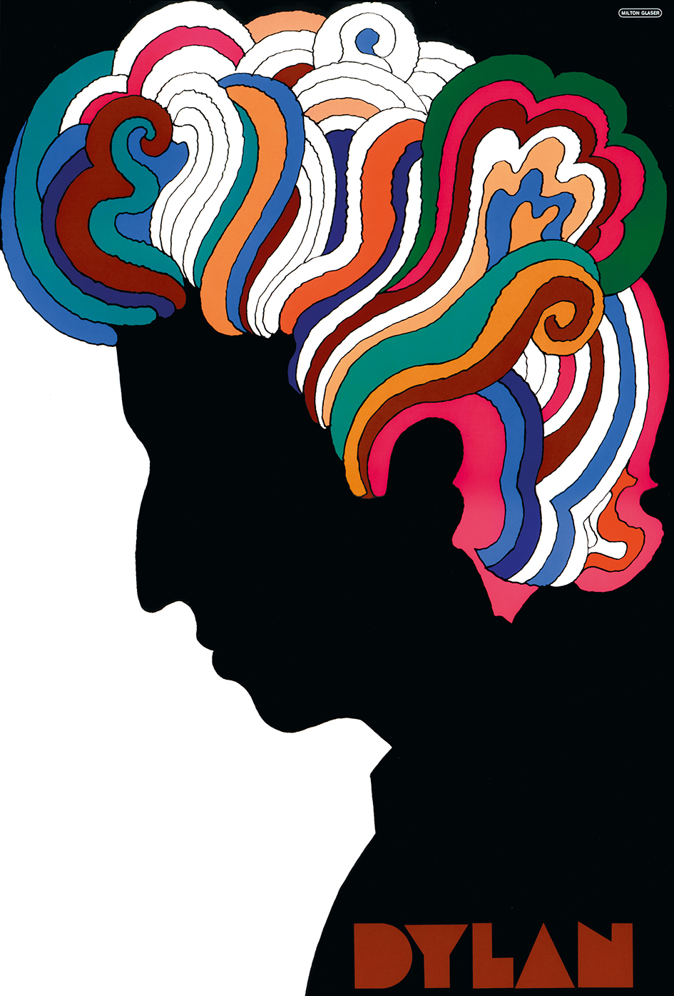
Glaser has quite a different-ish style whilst still following the rules of design. He tends to use far more colours than most and he uses them to the accentuate and create shapes to make something from the bigger picture; such as the hair in this design of his, each lock is set out in a way that makes it believable to be hair, and they all have different colours next to one another, meaning they don’t meld all that easily.
When put together, one can see that Rand’s designs are far more simple with easy drawings and complimenting colours, and Glaser’s designs are more out there with colours, and a bit more complex, they both use colour co-ordination very well and know how to make things pop and easy to read.
GOOD & BAD DOUBLE PAGE SPREAD LAYOUTS.

This is a good double page spread- it’s easy to navigate and pleasing on the eyes wide only three-four colours, the picture goes well with the graphic design on top of it and it’s very easy to find what you’re looking for, as well as credits.

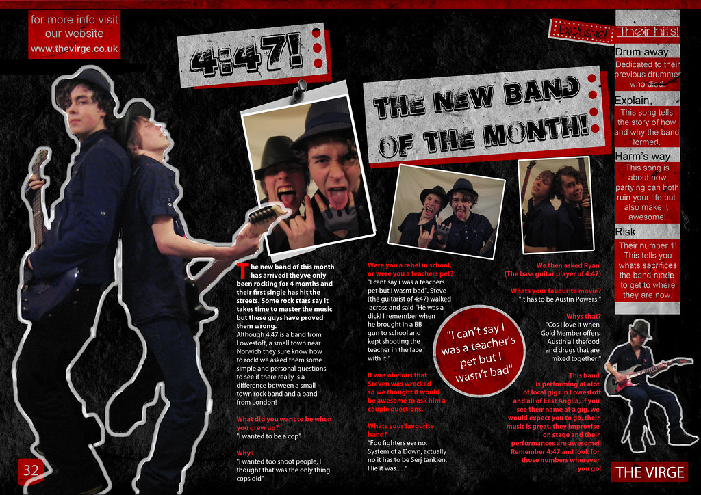
This is also a good double page spread, as it’s easy to navigate and easy to know where everything is, and the colours blend rather well, too! There’s good use of photography and word placement, though the left side is a little bit difficult to read at first.
This is a bad design spread, the images are distracting and not many people can read the bright red text on the page, the spread is more images and less actual article, which is also a shame, too- the colours and the chaos clash horribly with this as well.
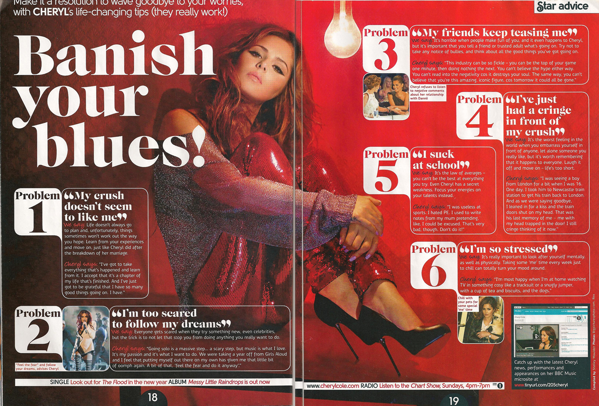
This is also a bad double page spread, as the text itself is ranging between too small and unreadable colours. The image is also rather distracting as well, and the way the problems are laid out is pretty random and not well put together.
ARTICLE I WOULD USE.
I would use an article about the chronic illness spoon theory- most articles are rather long, so I thought it would be best to surmise it as best as I can, I will be using the main part of one article for the sake of simplicity, as the main goal is the explain the spoon theory.
https://happiful.com/what-is-the-spoon-theory/
PRE-PRODUCTION AND EXPLANATION.
Due to the lack of resources to create the actual double page spread, the very least I can do is show the pages I would have created with specific art programs such as Medibang and so; with Medibang I can just create a double page spread by multiplying the width of a single A4 canvas. I thought it’d be better to do it in Medibang than on paper, as it’s much cleaner to look at.

Like so, with this I can use the box and line tools to make the simple layout for the spread, using red to highlight important titles and credits.

To explain things simply, the images would be like stated- the bigger image is a diagram for the spoon theory, explained simply and easy to read, the right two images would be doodles of my own design- a person performing such activities that takes spoons away, most likely reading a book and taking a walk outside, easy doodles to explain how easy the theory is to understand.
I would have made the background colour a shade of blue, something easy on the eyes as well- like #cad6de, and I would have made the text and titles dark shades of blues, #5e788a and #2c485c respectively, bigger titles would have a very dark shade of blue to make it pop, like #1f324d.
EVALUATION.
Overall this unit was relatively pretty easy-going and fun to do, I learned about different types of design spreads and learned to make some of my own, even though I wish I had more experience since then I could make it better. However, I did have a lot of fun speculating over the spreads I could see at first glance, and the contextual perspective was fun to delve into as well. The double page spread creating was also really fun to do, and I loved working through it, even if I couldn’t finish it in the slightest, I had a good time with coming up with ideas for it, after all.
